#apple

The new iMac 24-inch

20 April 2021
New iMacs in multiple colors

Today, Apple introduced the new iMac 24-inch. Based around the new M1 chip debuted last year, this surely will be a blazingly fast machine. A few initial observations:

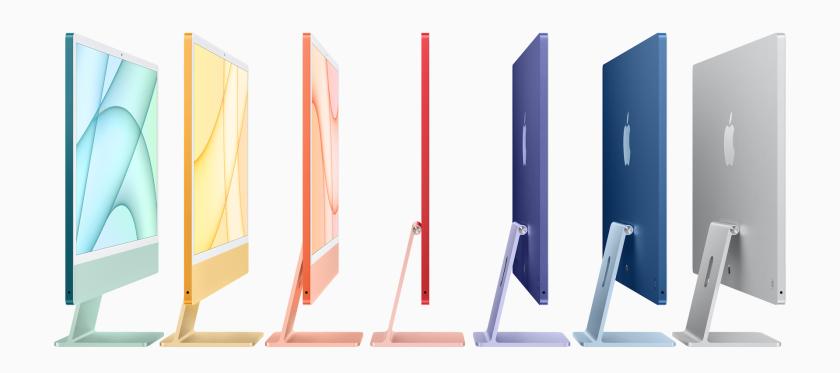
  • The new colors definitely look cool (unfortunately, a black option is missing)
  • Only USB-C / Thunderbolt ports, no USB-A or card reader
  • The power supply is now a separate brick, which was probably required given the thin design (only 11.5 mm!). The brick itself is not color-matched with the iMac body.
  • The power brick includes an ethernet port, which is quite smart I think
  • New Magic Keyboard, Magic Mouse and Magic Trackpad are color-matched with the iMac body.
  • The front of the new iMac has nearly white bezels. At first sight, this looks extremely weird to me. Practically all other Apple devices have black bezels... Not sure why they went with such light bezels for the iMac.
  • The typical iMac "chin" is still there, but the Apple logo has been removed. This too is rather strange... Looks like those iMacs they use in TV shows, were they tape over the logo.
  • No word on a bigger screen size comparable to the current iMac 27-inch (which is still for sale). Maybe that version might get a more dark design with black bezels, who knows...

It's a bit ugly indeed, so I fooled around a bit and did some manipulations to the design :-) The mockups below show how the iMac would look like with black bezels and additional Apple logo on the chin.

Silver iMac mockup with black bezels and front Apple logo
Yellow iMac mockup with black bezels and front Apple logo
Blue iMac mockup with black bezels and front Apple logo, together with MacBooks and Mac Mini

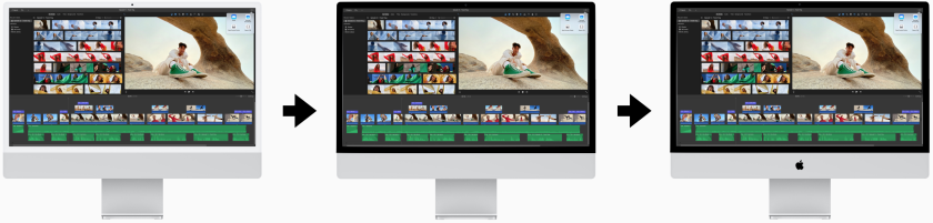
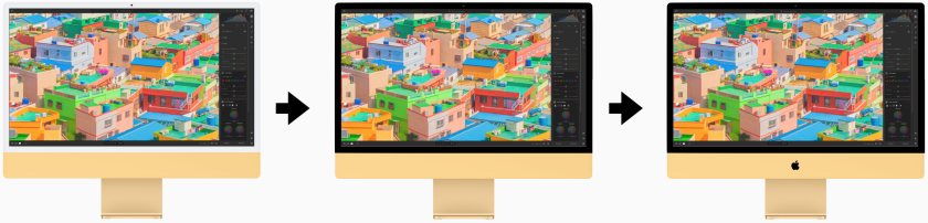
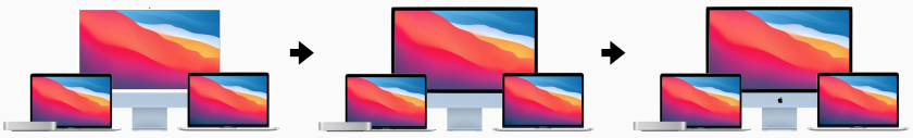
To me, that looks a lot more inline with the rest of the line-up. Furthermore, black bezels tend to be more easy on the eyes as a frame for the content displayed on the screen.

The current Mac line-up

17 June 2020

On the occasion of recent rumblings concerning the iMac getting a potential refresh very soon, I looked into the current Mac line-up as a whole. Turns out, Apple has a pretty decent and clear Mac offering nowadays.

The Mac product strategy anno 1998

Take a look at the video below of Steve Jobs introducing the very first iMac in 1998:

He starts off by discussing the Mac product strategy from that time, using a simple quadrant. Back then, there were two main product categories: desktops and portables. Jobs also identified their target audiences: both consumers and professionals. This resulted in a line-up of 4 Macs.

The Mac line-up anno 2020

If you look at today's Mac offering, the products can be organized in a similar way. Except now Apple offers Macs in three product categories. Mac desktop computers can be divided in two subcategories (see image below): all-in-one desktops and modular desktop systems in which the computer itself is separated from it's peripherals (keyboard, pointing device and display).

Grid showing the current Apple Mac line-up

Cool thing is that, except for the iMacs, all products are in good shape. The list below shows an overview of recent product refreshes:

  • Mac mini: March 2020
  • Mac Pro: December 2019
  • MacBook Air: March 2020
  • MacBook Pro: 13 inch: May 2020 / 16 inch: November 2019

The iMac had its latest refresh in March 2019, while the iMac Pro was never updated since its release in December 2017. New iMacs would really make the current Mac offering complete. I would also welcome a new industrial design (the current design dates back to October 2014). Let's see what Apple will announce next week during WWDC...

Compare this to the situation we were in a couple of years ago:

  • There was no real viable offering for Apple notebooks: underpowered and pricey 12 inch MacBook + a horrible keyboard on all the MacBooks from the previous generation
  • Professionals were begging for a true modular desktop Mac (the "trash can" Mac Pro was unable to fulfill the needs of the most demanding customers

Quick volume adjustment with the MacBook Pro Touch Bar

27 October 2018

A traditional MacBook keyboard used to have 3 buttons to adjust sound volume: Mute, Volume Up and Volume Down. These buttons were all mapped to the function keys of the keyboard.

Since 2016, the MacBook Pro started shipping with a component called the Touch Bar (see image below). The Touch Bar replaces to top row of keys in the keyboard (the escape key, the function keys and the power button) with a touch sensitive OLED strip, including a finger print sensor which also acts as the power button. In the Touch Bar, the traditional function keys moved in to what is called the Control Strip, a small region in the far right of the Touch Bar which is collapsed by default but can be expanded by hitting an arrow button.

Touch Bar on the MacBook Pro

The volume controls are also located in that region, but when collapsed only 2 buttons are shown: Mute and Volume Slider. To make quick volume adjustments, you can tap the Volume Slider button and use the slider to adjust volume (you can do this in one operation). This works pretty fast, but I find it hard to quickly adjust the volume step-by-step.

Now, I accidentally discovered that there seems to be an alternative interaction which allows for very quick and accurate volume adjustments: swiping the Volume Slider button (see video embedded below). Really nice!

BTW, this interaction also applies to adjusting screen brightness.

Dark Mode for the Web

25 October 2018

The latest version of Safari Technology Preview for macOS adds "prefers-color-scheme" media query support. This allows developers to serve up alternative CSS specifically for light and dark color schemes. I find this an interesting feature, since most web pages look "pale" when visiting with Dark Mode enabled in macOS Mojave.

I played around a bit with this new media query and updated my blog to have a dark color scheme available. To try this out yourself, please visit my website using Safari Technology Preview 68 in macOS Mojave and turn on Dark Mode (under System Preferences > General), or check out the video embedded below.

Technical details

Included below a very simple code snippet which you can use to detect the color scheme preference of the visitor:

@media (prefers-color-scheme:dark) {
  body {
    background-color: #2f2f2f;
  }
}

Update (March 25, 2019)

Dark Mode support is now enabled by default in the new Safari 12.1 release.

About the iMac Pro internals

27 August 2018

Check out the iFixit teardown for the iMac Pro embedded below. I find the level of fit and finish and customisation in these machines quite amazing. Especially the perfect symmetry of the speakers and the cooling system and the precise layout of the PCB's.

Change the default column width in macOS Finder

23 August 2018

When working with Finder in macOS, I generally use Columns view since it allows for easy navigation through a deep directory structure while maintaining some sort of "breadcrumb".

When dealing with lengthy folder- or filenames however, it is often needed to expand the column width for every column to see the directory contents in detail. By default, the width of the columns is reverted back to its original state when opening a new Finder window.

Finder with narrow columns

It appears that if you resize a column (by dragging) while pressing the Option key (⌥), Finder remembers your preference and maintains that width as a default. Very handy!

Finder with wide columns